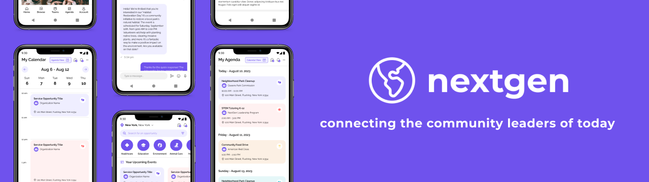
nextgen - a community platform
About the Product
NextGen is a community service search and social platform aimed towards young adults, where users can browse and search for service opportunities, track their schedule, and engage with other users and organizations.
I worked on this project between August 2023 and September 2023 as part of the Google UX Design Professional certificate. The goal for this project to complete the UX design process for both a native mobile app and a responsive website following a mobile-first design philosophy.
The Goal
Community service is an important part of the lives of young adults. However, it can be difficult to juggle community service with busy schedules or find opportunities nearby that match your interests. Our goal is to help the next generation of leaders have in impact in their local communities and engage with like-minded people while being able to maintain their busy schedules and pursue their interests.
My Role
I acted as the Lead UX Designer and UX Researcher for NextGen throughout this project.
My responsibilites included:
- Conducting User Research
- Planning Site Architecture
- Drafting Wireframes
- Creating Prototypes
- Conducting Usability Studies
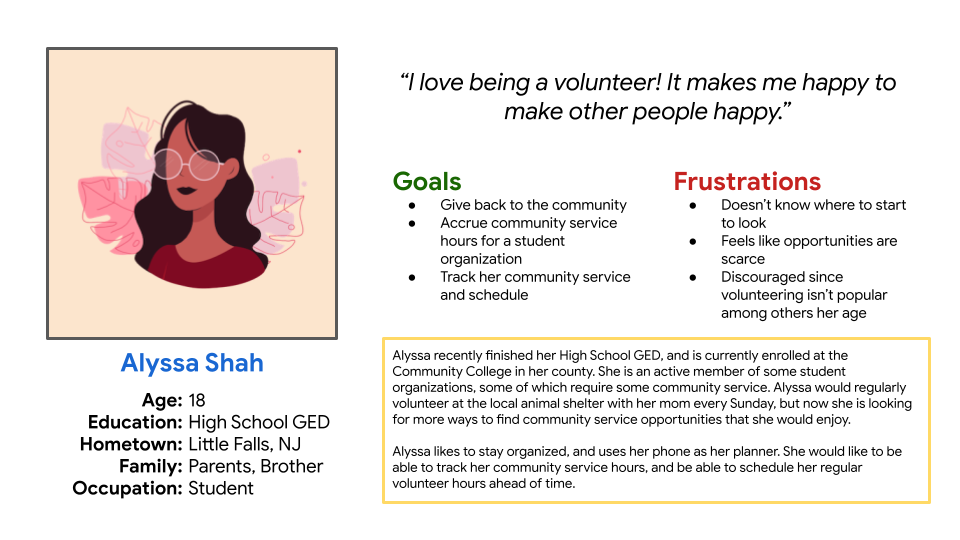
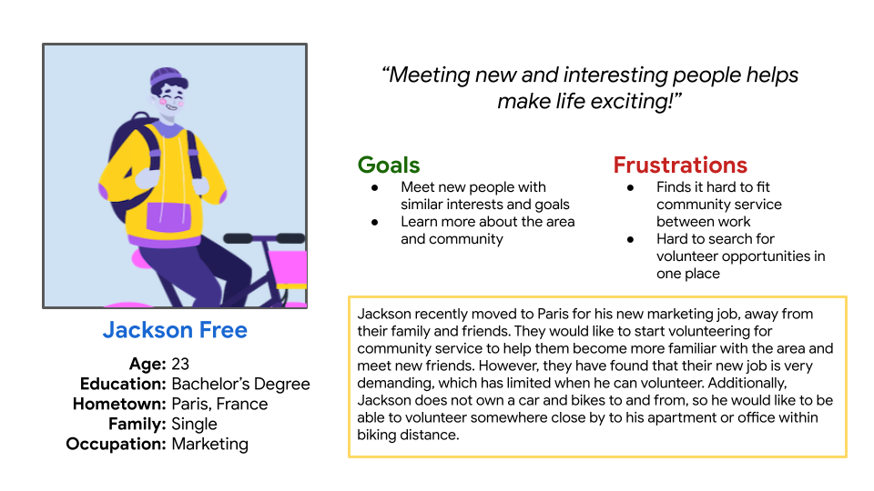
The User
To gain a better understanding of our users and their needs, I conducted a set of user interviews. Through these interviews, I learned more about their backgrounds, their goals, and their pain points when participating in community service, or when they are searching for service opportunities to join.
Many users want to participate in community service, or participate more often, but can’t find nearby opportunities or ones that match their interests. Additionally, it can be hard to fit these opportunities into their schedule while juggling school, jobs, and more. Current apps and websites lack the ability to engage with organizations and other volunteers, and also lack scheduling and tracking features.
I create two user personas based on my findings.
Challenges and Constraints
The biggest challenge I faced when creating my designs was translating the mobile designs to larger screens such as a desktop and tablet. I had to think about the size, look, and feel of each of the components before adapting them for use with other devices. I made sure to consider what tasks users will be performing on each of the devices, such as organization/management or browsing on desktop.Research Study
In addition to user interviews, I also conducted a competitive audit on similar volunteer search platforms, such as VolunteerMatch and AmeriCorps. I was able to identify areas of improvement, some key features that are important to a platform, and new opportunities such as a community forum, schedule management system, and direct messaging system between users and organizations. Here's what I found is most important for users:
- Information — Users are looking for specific information before signing up for a volunteer opportunity. Making this information easily accessbible will ensure that users can find the opportunities that fit them best.
- Search and Browsing — Users should be able to search and browse for opportunities quickly, meaning they need to know the most important information first.
- Organization — Users would like to stay organized. Having a lot of opportunities can make the schedule confusing and difficult to follow.
Design Concepts
Before working on my initial sketches and wireframes, I used the How Might We and Crazy Eights exercises to generate several ideas and solutions.
This was the result of my How Might We exercise:
- How might we make searching for volunteer opportunities fun and interesting?
- How might we connect young adults with community service in a fun and engaging way?
- How might we make communication with volunteer organizations more personal?
- How might we make a way to manage schedules less stressful for volunteers so that they can focus on what’s important?
- How might we gamify the volunteering experience?
- How might social media help promote volunteer services?
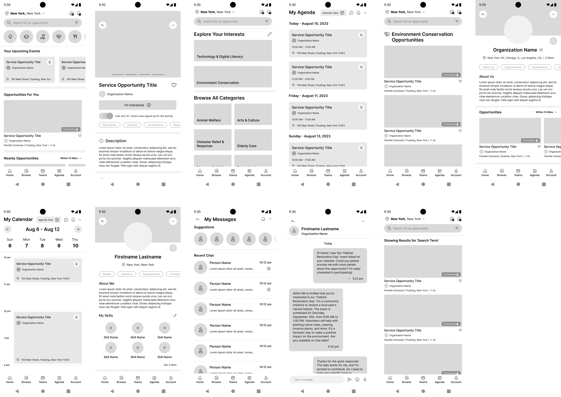
Sketches and Wireframes
My initial paper wireframes can be found below:
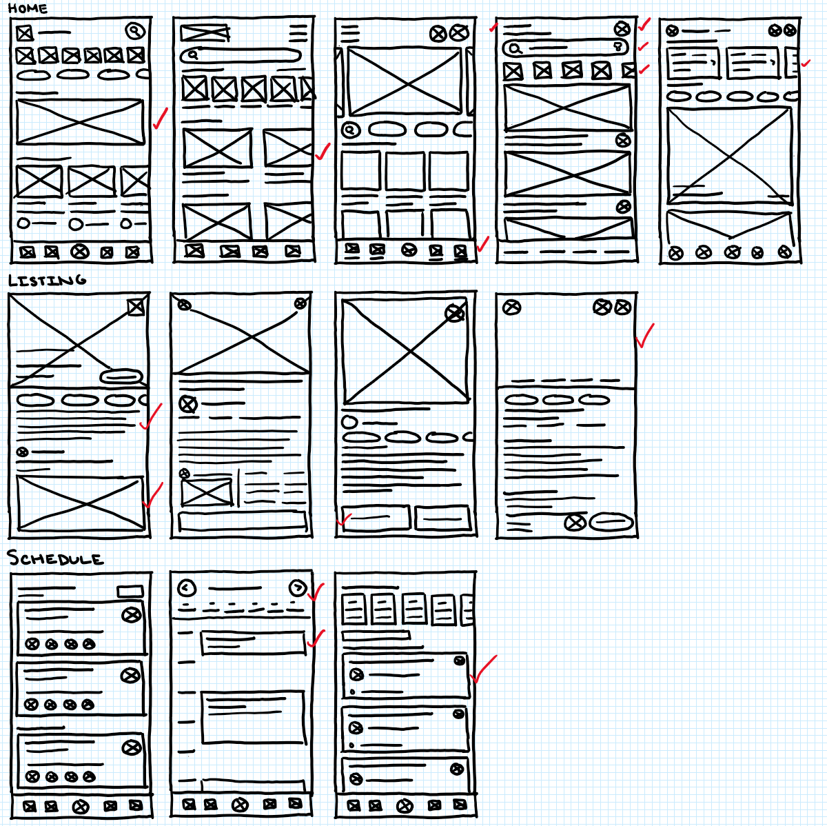
After completing the paper wireframes, I selected the best components from each of them to create the final paper wireframes. From there, I translated them to digital wireframes on Figma.
For each of my designs, I prioritized making the information that users need easy to find while browsing. This includes being able to quickly find information for each listing, such as location, proximity, and the organizer. Additionally, users who are logged in are shown a display of their upcoming schedule as the first item.
For the listing screen, it was important to make sure that users are able to find more descriptive information. When users want to sign up for an opportunity, they are shown a modal to continue to sign-up process.
User Testing
I conducted a usability study to recieve feedback directly from users for the design and find areas of improvement. The low-fidelity prototype used for the study can be found here.
Usability Study Findings:
- Users want exhaustive search and filtering to find the opportunities that fit their needs, including proximity, categories, and availability.
- Users want a quick and easy browsing experience to help them find opportunities without too much friction or stoppages.
- Users would like as much information as they need to help them make decisions before committing to an opportunity.
Mockups
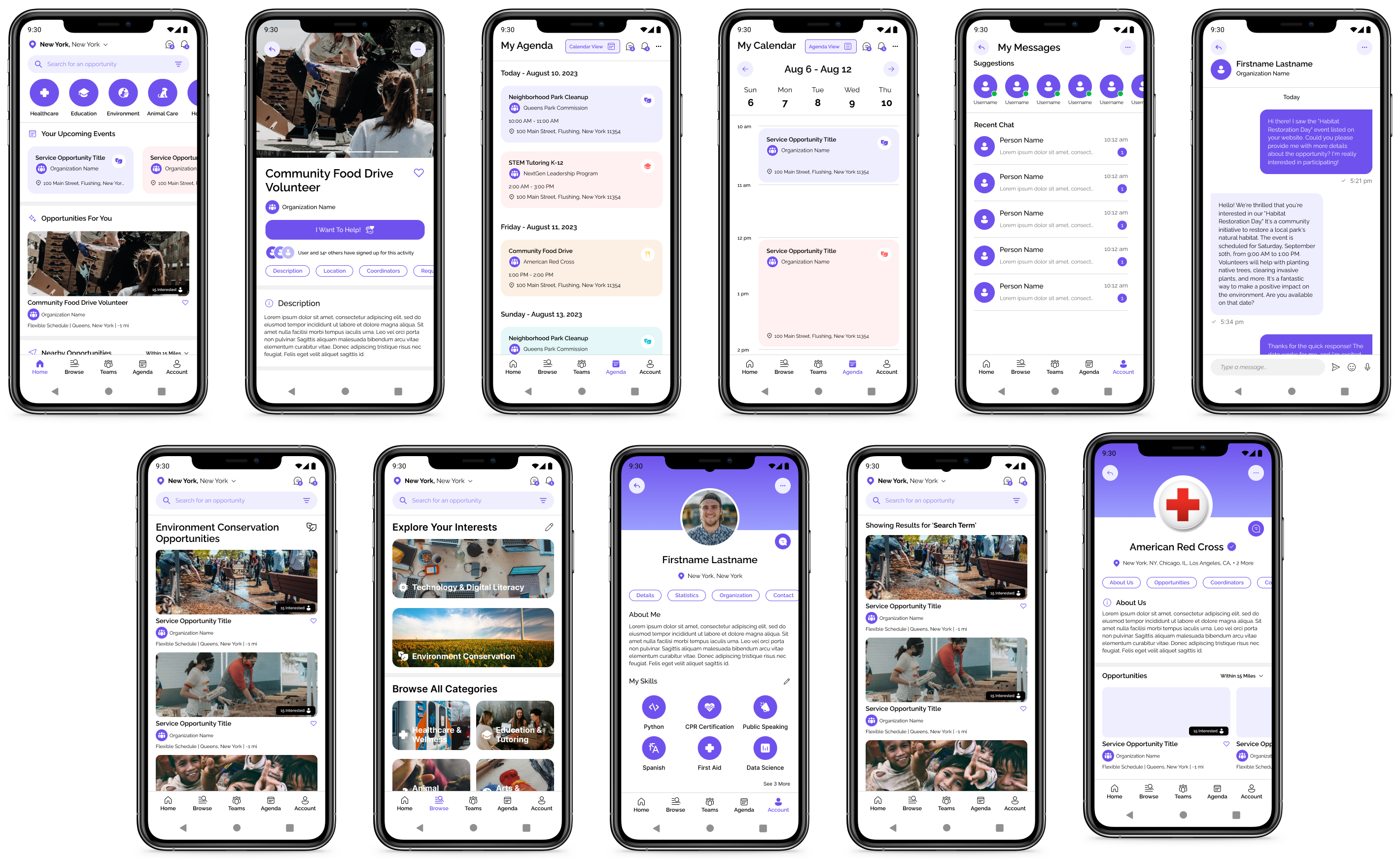
During testing, users noted that the categories browsing page felt very flat and bland. It was also very difficult to identify categories at a glance. Based on this feedback, I added background images to each of the cards and the appropriate icon for each category that is used throughout the app.
To keep consistent with labeling, I also added category icons to the scheduled event components, in accordance with some user feedback during testing. Additionally, I increased the size of the titles to make them more distinct from the rest of the content, and increased the spacing between the dates groupings.
The high-fidelity prototype can be found here.
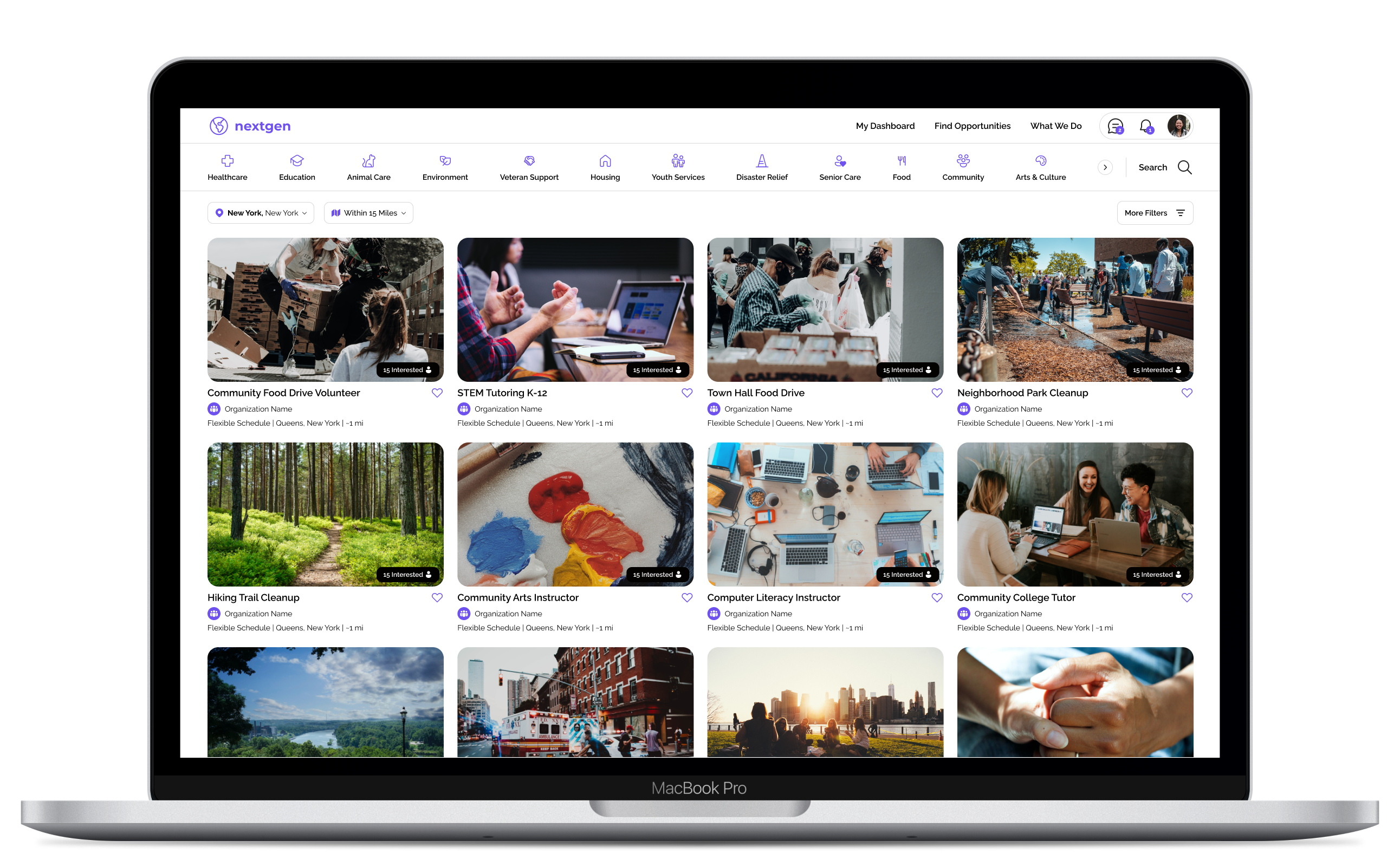
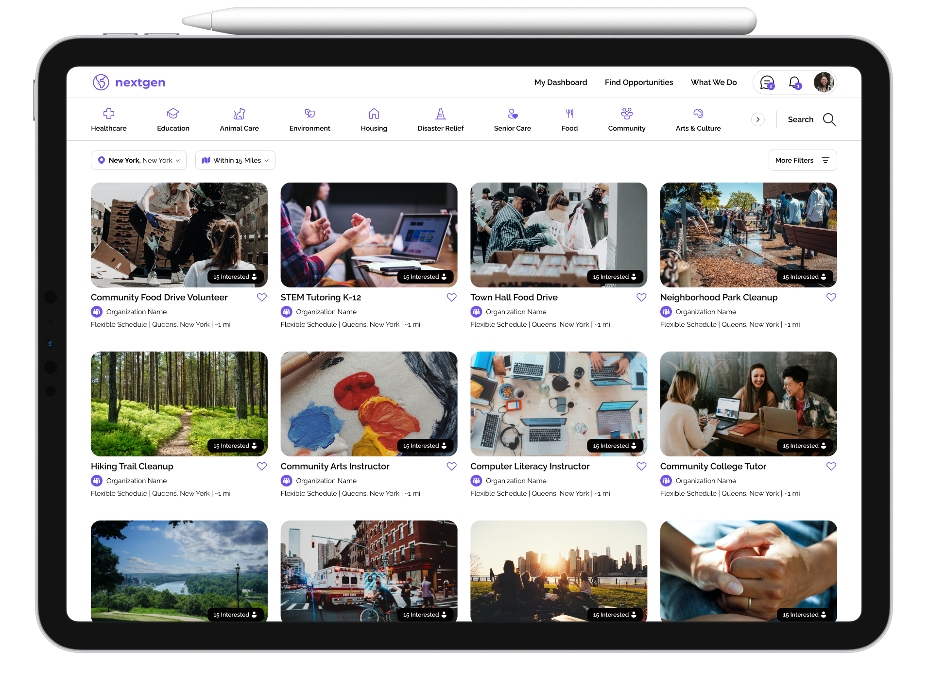
Responsive Designs
For the Desktop and Tablet versions of the app, I wanted to make sure users are able to browse for listings effectively, so I chose to use a Grid of Cards layout for the home screen. The desktop version has larger card sizes, and can display more categories on the navigation carousel.
Accessibility Considerations
Here are some of the ways accessibility was considered in the designs for NextGen:
- Contrast and Visibility — In instances where there is colored text, or text over images, I tried to make sure that the text has proper contrast and is easily legible. For background images, the exposure has been decreased to help with this.
- Iconography — Iconography is consistent throughout each of the designs to help identify categories easily and at a glance. Similarly, action buttons are consistent components throughout the app.
Impact
This app will allow the today's growing leaders have a greater impact in their own communities and connect with each other.What I Learned
While working on this project, I was able to learn about what is needed to complete a fully responsive design for a website and app, and the differences in design philosophy that can be taken between each of the screen sizes.
I continued to practice using Figma's different design features. I was able to use the variations and variables feature in components to make reusable components throughout my designs. Through this, I was able to make an extensive sticker sheet that helped me make my designs consistent, even between screen sizes. I also made use of the Fluent Design system for iconography.
Next Steps
This project took a bit more work than my previous design projects as I had to take into account the differences between a native mobile app and the responsive website. With that said, some of the next steps I have started to think about are:
- One of my priorities is to consider additional accessibility features that can be included to improve the experience of the app for different users, including a high contrast mode, extra languages, or further filter options for listings.
- There are also opportunities to add more community features, such as comments, a discussion forum, or individual posts so that users can share their volunteer experiences and engage with others on the platform.
- There is always room to improve the readability of the app, the organization of information, and the overall user flow. Making sure users are able to navigate the site well and find all of the info they need is important and can continually be iterated upon.