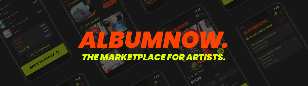
ALBUMNOW
About the Product
ALBUMNOW is an album pre-order and e-commerce app that does releases for upcoming artists of many different genres. A wide variety of merchandise is available for purchase, including vinyls, clothing, and more.
This project was completed as part of the Google UX Design Professional certificate. The goal was to create complete the UX design process for a mobile app.
My Role
I served as the lead UX Designer for ALBUMNOW to deliver designs for a mobile app from conception to delivery.
My responsibilites included:
- Conducting interviews and usability studies
- Paper and digital wireframes
- Accounting for accessibility
- Low-fidelity prototypes
- Iterating on designs at each stage
- High-fidelity prototypes
The User
For my research, I conducted interviews with music listeners and created empathy maps to help myself understand the users I am designing for, and to learn more about needs and frustrations during musician pre-orders. Additionally, I performed a competitive audit to gain insights from similar apps. I was able to identify one primary user group as busy students or early career working adults who have limited time.
Through my research, I was able to identify some common concerns that users had while trying to purchase limited merchandise, like items going out of stock while checking out, missing or forgetting about the pre-order window, poor information availability and accessibility issues during the checkout process.
Challenges and Constraints
The biggest challenge for this project will be making it more convenient for users to access pre-orders and complete the pre-order process. Since the primary user base are students or working adults, time and convenience is of extreme importance. They would like to be able to complete orders in a timely manner without issues or roadbumps. In my own experience with completing orders for limited items or merchandise through mobile apps, the experience can be frustrating with dropped connection, slow processing, and having to input payment information quickly at the end. All of this to get ahead of scalpers and the like. It is extremely dissapointing to find that the item you want has been sold out even after you put it in your cart.Research Study
During my research, I was able to identify three main user pain points that users commonly experienced while using other merchandise or pre-order apps for their favorite artists.
- Time — Students and working adults are busy most of the time, and have limited time to complete limited orders
- Info and Navigation — Music merchandise apps can make it hard to find the info needed to make an informed purchase easily and quickly, and it can be difficult to move between pages
- Accessibility — Some apps fail to consider accessibility through language and currency options.
Design Concepts
To help ideate, I used the How Might We and Crazy Eights exercises to generate several ideas and solutions. These exercises allowed me to think about many different solutions of various levels of creativity and feasibility.
Sketches and Wireframes
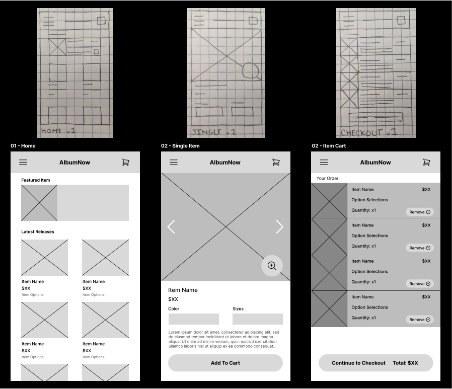
I was able to make many drafts of potential screen and app layouts on paper to test and visualize different designs that address user pain points. For the main screens part of the checkout flow, I wanted to make sure users can easily scan for the important information, and if interested, go into more detail on the next page.
My first wireframes were created on paper, while the digital wireframes were made on Figma.
User Testing
To gain further insights into my designs, I conducted two rounds of usability studies. Findings from the first study helped me transition from wireframes to mockups. The second study allowed me to refine the high-fidelity prototype I created to improve the mockups further.
These usability studies were conducted using the low-fidelity prototype.
Round 1 Findings:
- The app menu labels were misleading
- Users want simple and direct navigation
- Users want to know the number of items in their cart
Round 2 Findings:
- Users were confused by inconsistent save button designs and placements
- Users want the ability to filter items while browsing
- The placement of the back button was inconsistent between pages
Mockups
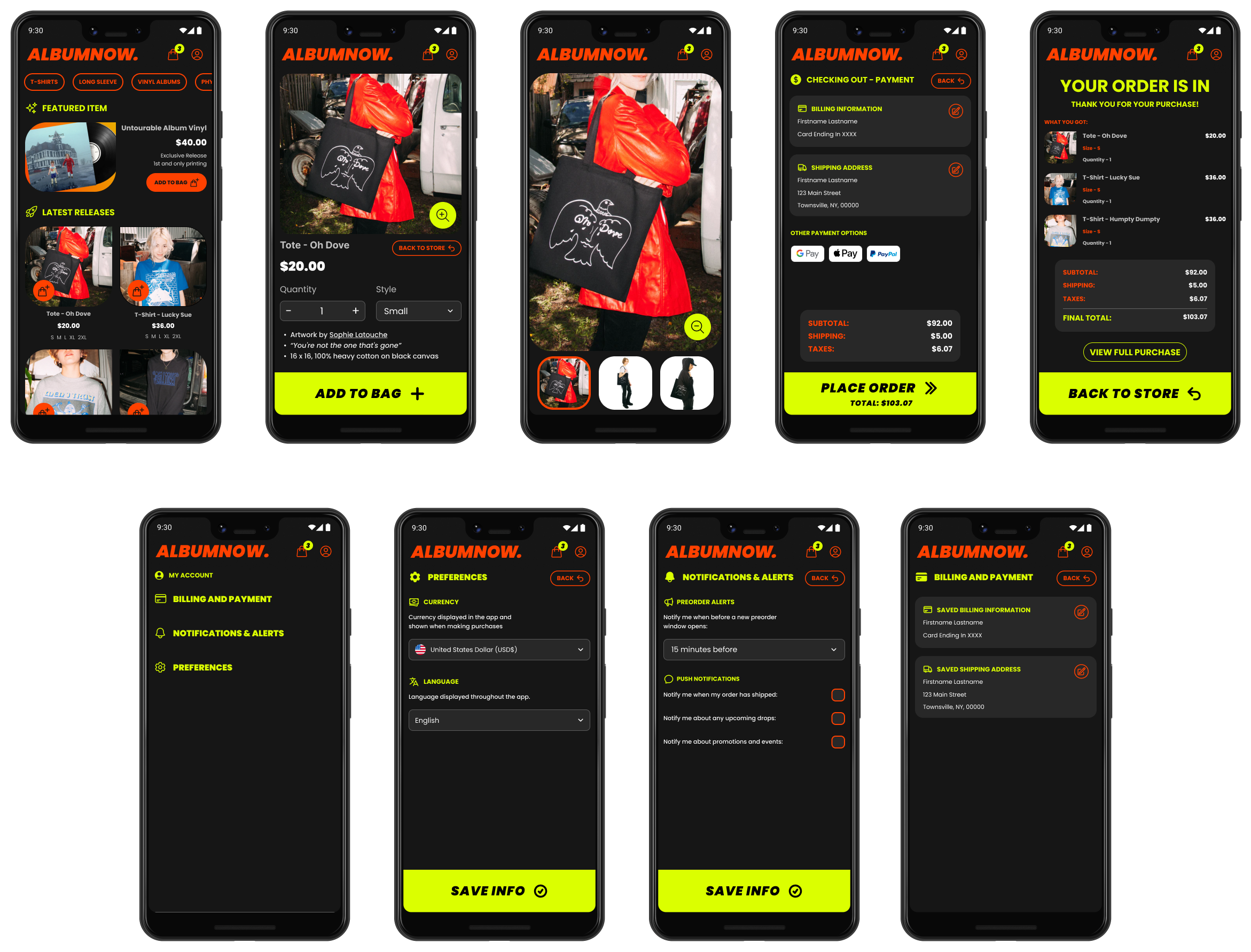
Initial designs had wasteful margins and spacing. After receiving feedback, I decreased page margins to make page elements larger, including store items, and the app title. Additionally, I added in an item filter using toggleable tokens at the top of the store page based on the usability study findings.
Based on one of the insights gained from initial user tests, I made sure to locate the back button at the top of each of the settings pages. This ensures that the designs are consistent. Additionally, each settings page was made to have a single action button at the bottom of the page to save.
The high-fidelity prototype can be found here.
Accessibility Considerations
Making sure that our app can reach all of our users was a central focus in my designs. Here are some of the ways accessibility was considered in the designs for ALBUMNOW:
- Visibility and Readability — Ensured that text and on-page elements comply with contrast guidelines for the best visibility and readability.
- Global Language — Included the option to choose language preferences in the app settings to change the displayed language throughout the app.
- Global Currency — Included the option to change currency preferences for item price display for the checkout process.
Impact
ALBUMNOW helps users identify and connect with their favorite artists by allowing them to purchase limited merchandise and pre-order albums in a convenient and efficient way.What I Learned
While designing the ALBUMNOW app, I learned just how important iterating on your designs is, and conducting multiple rounds of research. With every iteration of the cycle, I found great improvements in my designs that better addressed user needs.
I was also able to learn a whole lot about how to effectively used Figma. I was able to leverage the components feature to make different reusable pieces that made editing and creating my designs much easier. Aditionally, the autolayout feature proved to be extremely useful.
Next Steps
After reflecting on the work I completed during this project, some of the next steps I would like to complete are:
- Conduct further research, including additional rounds of usability studies, to determine whether accessibility concerns have been successfully addressed.
- Conduct further user research to find further features that may be included to address user needs and improve the overall checkout experience.